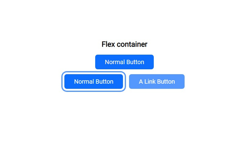
The Button that every Front-End developer should use, the written once-and-forgotten code!!!
I know it's just a button, but you'll write the code once and forget it, because it will work under all circumstances.
Why would I need a magic button?
I mean, who doesn't want a magic button? a Button that always works!
behaves as you expect it to behave and stays where you put it in the size you specified. I think you already have enough layout and responsiveness problems to add a bad button problem, I know it's just a button why overrengine it?
Because you will write the code once and forget it, Don't believe me, you can go to review the code on:
But if you want to understand how I made my magic button. Well, continue reading!
HTML <button></button>, Well not that simple!
If when you press the button and something happens use <button></button>
add type=”button” To tell the browser how this button behaves, or any other button
if the button is icon only “no text” add aria-label=”description”
if the button is disabled add disabled and aria-disabled=”true”
<button type="button">normal</button>
<button type="button" aria-label=”star”>*</button>
<button type="button" disabled aria-disabled=”true”>disabled</button>
If when you press the button, you move to another page use the Anchor element
add role=”button” to specify to the browser what is the role of this link.
<a href="#" role="button">link</a>
But if you do not know which one to use, I recommend reading the following: Anchors vs Buttons
if you're thinking of using anything else as a button, here's a message from the smart people of Mozilla telling you why this is a stupid idea.
Note: If using role="button" instead of the semantic [button] or [input type="button"] elements, you will need to make the element focusable and define event handlers for click and keydown events. This includes handling the Enter and Space keypresses in order to process all forms of user input.
CSS that just works!
I want to admit something; I'm obsessed with buttons!
I've always been interested in creating the perfect button, as the first thing I do when trying a new library is check how they made the button, I even built a library specifically for that, a library that aims to provide only the Important items with high quality, you will find there even a more overrengined button, and If you would like to get it or help me to overengineer the front-end world with some high quality react component, visit Moon-RockUI
Help me launch version 1.0.0 soon!
Some basics before we start:
I will use
remandema lot and other CSS units, if you want to know more, I advise you to read this: CSS Units ExplainedIn general, I use CSS custom properties in my own code, It gives me superpowers, but I won't use them in this article
Button Size:
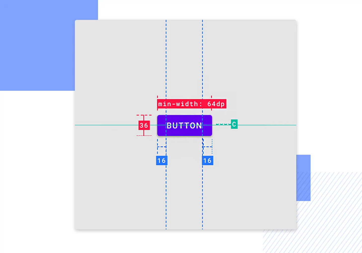
the trick here is not to specify a fixed size, but rather to set limits for the largest and smallest size, as the button size will depend mainly on the font size, to determine the size we will follow the basic design rules for buttons to find out more, I recommend reading this: Button design for websites and mobile apps
.Button {
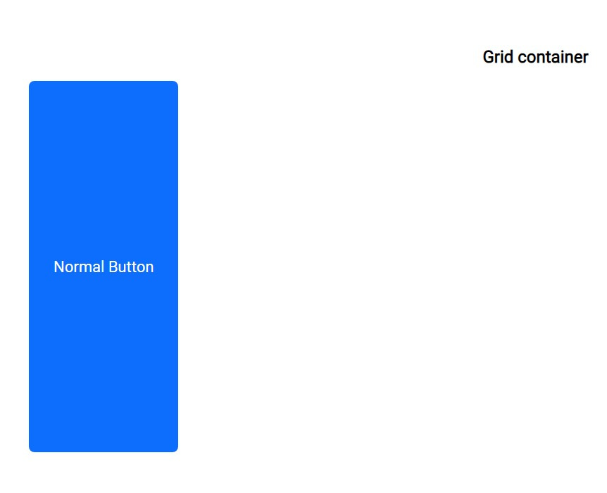
    width: fit-content;
    max-width: min(100%, 100vw);
}
@supports not (width: fit-content) {
	.Button {
		width: auto;
	}
}
width: fit-content;
we use fit-content as the size will use the available space, but never more than
max-content.
max-width: min(100%, 100vw);
You specify the largest width that the element can reach max-width
using the min() To choose the smallest value between 100% linked to the size of the parent element, which may be half the screen for example.
100vw linked to the screen size.
You do this to allow the element to expand ( if desired ) to either parent size or screen size, without any overflow.
Button layout, display & Align:
I used to use display: Block then I used display: inline but when I was learning React I discovered MUI, and as usual, the first thing I did was look at how they did their button and I found them using inline-flex!
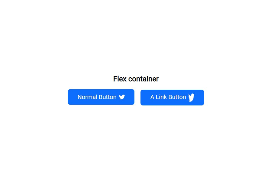
inline-flex The element behaves like an inline element and lays out its content according to the flexbox model.
.Button {
  display: inline-flex;
	justify-content: center;
	align-items: center;
	vertical-align: middle;
	text-align: center;
}
using the magic of Flex We will center any items inside this button. with:
We will use properties like text-align & vertical-align in general for:
To make sure an extra image or strange text is always in the middle.
For the person who still uses an old browser (for browser support) In case Flex doesn't work for some reason.
Button properties, Padding & Font-size:
Here lies the magic that makes this button work in all cases and all sizes.
.Button {
    padding: max(0.5em, 0.5rem) max(1.5em, 1.5rem);
    font-size: clamp(0.875rem, 0.7rem + 0.7vw, 1.375rem);
}
@supports not (font-size: clamp(0.875rem, 0.7rem + 0.7vw, 1.375rem)) {
	.Button {
		font-size: 1rem;
	}
}
this seems more overkill than the max-width trick and it is, but You will only copy this code once and it will work in all cases.
padding: max(0.5em, 0.5rem) max(1.5em, 1.5rem); The trick here is to use max() Where if you notice that I use the same value once with rem and once with em but why?
The point of max() is to choose which value is greater; Usually, em will be bigger, Whereas if we assume that the font size of the button is 24px.
em = 24px and rem = 16px Follow the default browser size
So why do we do this? In general, when using a small font size such as 12px if you use just em The button dimensions will be too narrow Since it is related to the font size, but then rem will be the biggest.
em = 12px rem = 16px Still at the default text size
we use this trick to define the minimum space inside the button and at the same time it allows the button to grow with the font size.
font-size: clamp(0.875rem, 0.7rem + 0.7vw, 1.375rem); Honestly, I cannot explain to you how to choose these values here, as I will need another article.
But in short using clamp() Allows you to use a font that is responsive to your screen size with a minimum of 0.875rem and a maximum of 1.375rem ( for Example ).
To make it easier, you can use a font size clamp calculator
I strongly advise you to read these articles, as they will benefit you as a web dev in general:
the Cherry on the Button:
.Button {
    overflow: hidden;
    white-space: nowrap;
    cursor: pointer;
    user-select: none;
    appearance: button;

}
overflow: hidden; To prevent anything from coming out outside the button.
white-space: nowrap; Prevent text from going to more than one line.
cursor: pointer; The cursor is a pointer that indicates a link. Typically an image of a pointing hand.
user-select: none; make The text of the element and its sub-elements is not selectable.
'user-select' is not supported by Safari, Safari on iOS.This is an optional feature where if the button contains important text, you may allow it
appearance: button; The appearance CSS property is used to control the native appearance of UI controls, that are based on the operating system's theme.
'appearance' is not supported by Safari on iOS < 15.4.
Button hover & focus:
Nothing special I just determined how the button behaves in different situations, and I used a cool focus ring trick I learned from the king of CSS.
.Button {
    box-shadow: 0 0 0 -0.4em hsl(0, 0%, 100%),
        0 0 0 -0.6em rgba(13, 109, 253, 0.7);
    transition: box-shadow 400ms cubic-bezier(0.66, -0.2, 0.27, 1.15);

}
.Button:active,
.Button:hover {
    opacity: 0.7;
}
.Button:focus-visible {
    box-shadow: 0 0 0 0.3em hsl(0, 0%, 100%),
        0 0 0 0.5em rgba(13, 109, 253, 0.7);
}
.Button:focus {
    outline: none;
}
Conclusion + Free gift!
I hope I kept my promise to you!
“the written once-and-forgotten code” thing, now go and copy the code. I want to fulfill my promise to you, If you would like to use a more complex button in your next project, you can visit Moon-RockUI, Where you can help me create the best button.
Free gift:
I always try to make everything perfect.
Just as I tried to make this button perfect, I also try to make the performance of my websites as high as possible, and I also try to make the Internet a perfect place, so I offer you my free gift; get Free Website Speed Optimization Services!
These stats are definitely not here to spook you into joining my free service:
A one-second delay in page load time can result in a 32% increase in bounce rate.
Google considers page speed as a ranking factor. Faster-loading pages are likely to rank higher in search engine results.
79% of online shoppers who encounter performance issues won't return to the website, and 44% of them would share their poor experience with friends.
So, let's make your website a speed sensation together! → Free Website Speed Optimization Services!
More From Us:
the complete code:
.Button {
    width: fit-content;
    max-width: min(100%, 100vw);
    display: inline-flex;
    justify-content: center;
    align-items: center;
    text-align: center;
    vertical-align: middle;
    overflow: hidden;
    appearance: button;
    user-select: none;
    text-transform: capitalize;
    white-space: nowrap;
    text-decoration: none;
    cursor: pointer;
    padding: max(0.5em, 0.5rem) max(1.5em, 1.5rem);
    font-size: clamp(0.875rem, 0.7220363289rem + 0.7648183556vw, 1.375rem);
    box-shadow: 0 0 0 -0.4em hsl(0, 0%, 100%),
        0 0 0 -0.6em rgba(13, 109, 253, 0.7);
    transition: box-shadow 400ms cubic-bezier(0.66, -0.2, 0.27, 1.15);
}
.Button:active,
.Button:hover {
    opacity: 0.7;
}
.Button:focus-visible {
    box-shadow: 0 0 0 0.3em hsl(0, 0%, 100%),
        0 0 0 0.5em rgba(13, 109, 253, 0.7);
}
.Button:focus {
    outline: none;
}
@supports not (font-size: clamp(0.875rem, 0.7rem + 0.7vw, 1.375rem)) {
	.Button {
		font-size: 1rem;
	}
}
@supports not (width: fit-content) {
	.Button {
		width: auto;
	}
}


